So I’ve been trying to improve my pixel art skills recently, and I took up a challenge to do a pixel art every day. I’ve compiled 22 tips, some obvious, and some not, about how to make better pixel art.
Video
The Work
Here are the best results from what I’ve worked on this past month:
You can find all these on twitter, along with some other stuff: @digimut3
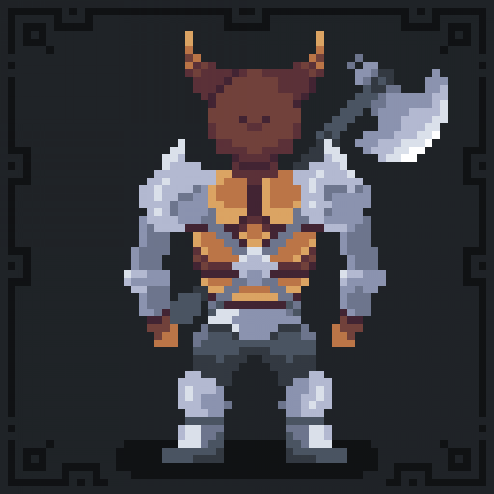 Minotaur
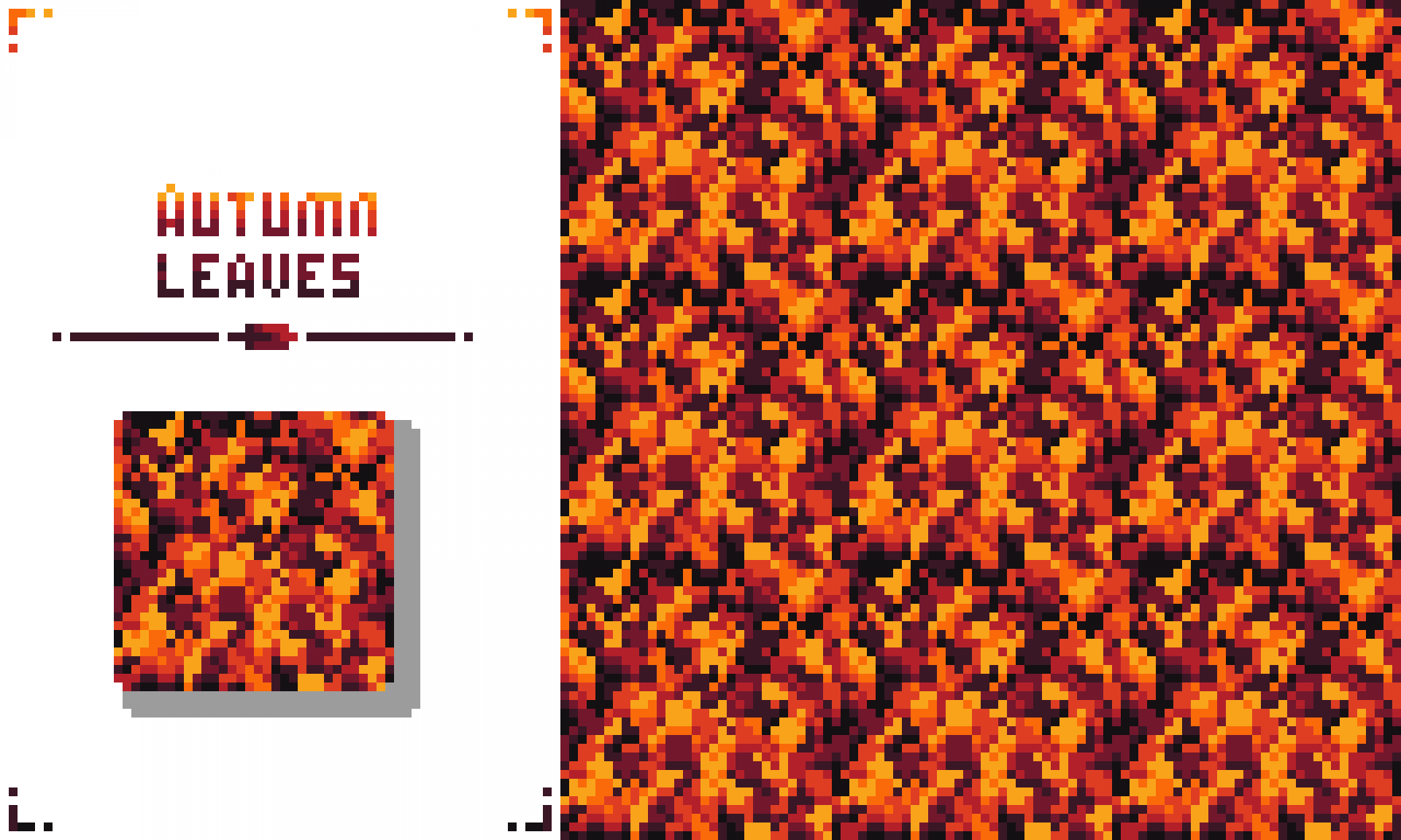 Autumn Leaves (Prompt: 32x32 Repeating Pattern)
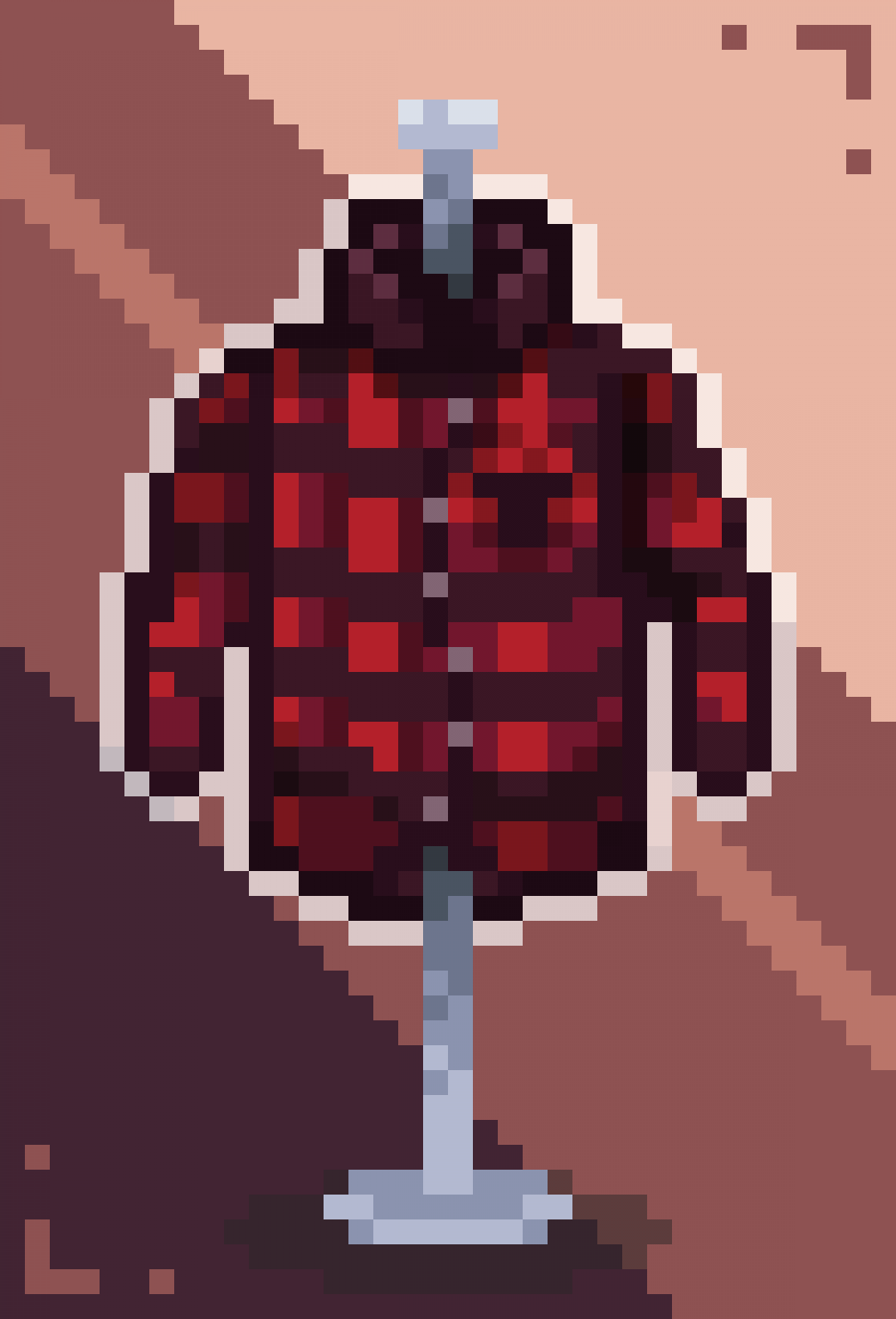 Flannel
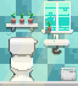
Bathroom
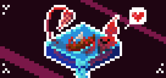
Kraken
Tips
Now I know that I still have a long way to go with making pixel art. It’s definitely not easy, but I’m making some progress and I’d like to share some things I’ve learned about making my pixel art look good.
Here’s my list of 22 tips and resources for becoming a better pixel artist:
- Practise daily. It took me about 30 minutes to an hour to make the pieces above. It can be hard to find inspiration sometimes, so follow the @pixeldailies themes or find miscellaneous art prompts online.
- Start off a character with a strong greyscale (black/white) silhouette, and build layers of shading on top of it. Don’t fully shade in a leg before drawing the head, because you might end up having to undo it.
- Be aware of your light source and constantly follow it. Shade consistently, as if light is coming from a certain point, and even use an overlay to position that light source.
- Don’t use symmetry tools for reflections, as they are rarely ever symmetrical. The same goes for shadows.
- Rebalance your image often and check a zoomed out view to see if your image becomes unbalanced.
- If you’re making something that you can look at reference for,** use an art reference** or multiple. PureRef is a free and expertly designed reference image viewer.
- Make use of idea generation techniques like brainstorming (come up with a lot of ideas at once, don’t discard anything) and SCAMPER (Substitute, Combine, Adapt, Modify, Put to Another Use, Eliminate, and Reverse) operations on your ideas to come up with more! Here’s an interesting blog post about it by Designorate
- Make use of autotiling tools if your software provides them, in order to make perfectly tiling, seamless textures.
- Take care with pixel clusters - large groups of similarly coloured pixels can detract from your image.
- Think about the amount of signal to noise you generate. As a pixel artist, your job is to extract the essence of a thing and express it with the fewest pixels possible! Be careful of excessive noise.
- If tiling edges are hard, blend them with a shadow but be careful not to make overly rigid lines.
- Try** shading your outlines**. Give them shadows and tints instead of being flat.
- Pick an element to frame and use high contrast shadows/elements to highlight it.
- Use a simple background. Don’t make it too distracting. Try analogous, desaturated colours. 14½. Drop shadows are very simple, put them on another layer and use that to sell its depth.
- For environments, create a simple B/W guide layer and overlay elements on that.
- Pick a strong theme and enforce it, with your colour palette, lighting style, and other elements.
- Another way to highlight an element is to give it contrast with the rest of your scene. Saturate or Desaturate as needed, add or subtract brightness to make it stand out.
- Tint your shadows. Indigo looks like night, so it’s a natural choice, but focus on your theme.
- Add volumetric lighting with a transparent overlay layer but watch out for shadows.
- Make an interesting story to go along with a strong theme. This really sets your art piece apart.
- Move outlines to a different layer so you can adjust them easily.
- Start on a higher resolution than you think you need. Removing details is easier than adding them.
Those are some of the things I’ve learned from this process. I think many of them are pretty obvious, but still good to keep in mind.
Thank you for reading!